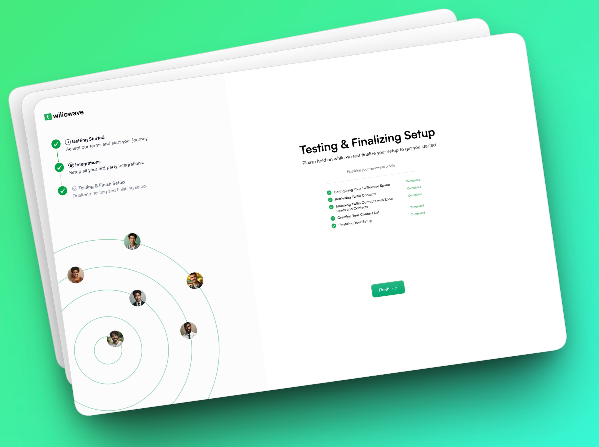
Technology • Web Development, Search Engine Optimization (SEO), Content & Branding Design, UI/UX Design
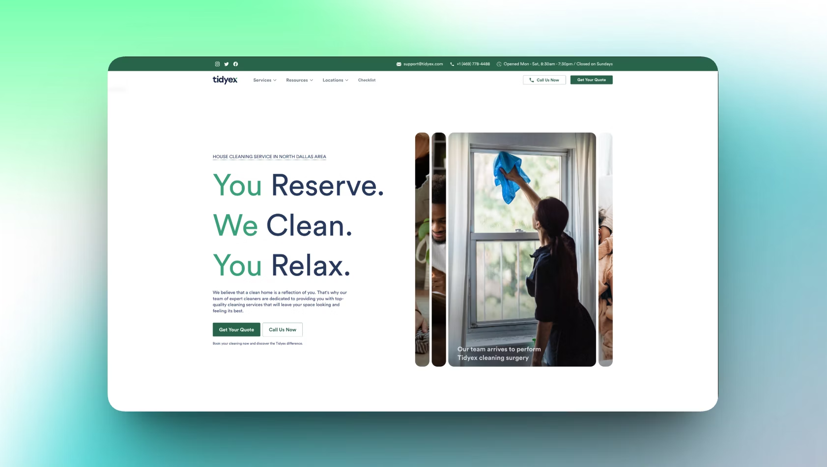
Tidyex Home Services
About Solon
Solon is a Web3 platform that helps users swap crypto, create NFTs, pool tokens, and join governance, all in one place. Based in Boston with a small team, Solon makes complex blockchain tasks feel easy. They aimed to create an automated market maker for NFTs that offered value and ensured community involvement.
They found that they required a partner to design their product in a way that made it understandable, modern-looking, and user-friendly. That’s where we came in, to turn their feature-rich platform into a smooth experience that anyone could explore and trust.
The Problem
Although Solon had great technology, people had difficulties connecting with it. Using the platform was difficult for people who had never seen it before. Because of this, they choose to rely on fewer Web3 tools.
Key issues Solon faced:
- Users experienced confusion while switching between the different functions.
- There was nothing about the site that made users feel at ease or confident in using Web3.
- At the start, it was not clear what the product was worth.
- The mobile app did not have a clear and uniform design.
- After landing on their website, users became less active.
Solon had to focus on UX to reach its highest potential. Without a clear and guided experience, even powerful features risked being ignored by users.
The Solution
To help Solon grow, we made their platform fresh, simple, and user-friendly for anyone new to Web3. We focused primarily on clarity, organization, and what our visitors would do next.What we delivered:
- Persuasive designs are now highlighted on the homepage.
- The user should be able to access Swap, Pool, NFTs, and Governance easily.
- Dark UI with vibrant accents for visual trust and modernity.
- The app feels and works the same on all devices.
- Clear pricing, wallet actions, and transaction flows
As a result, Solon’s system became both strong and user-friendly, which encouraged more individuals to join and use it.
Design Process
Our Solon design process follows a Lean UX methodology that is comprised of 7 steps, broken down into 4 phases. The methodology provides business-oriented steps supported by the principles of transparency and the requirements for speed and scalability.
UX Research & Design Artifacts
The first step to designing Solon was studying how users behave. We found out that navigation was unclear, there were too many steps, and guides were lacking. Through these insights, we created design artifacts that focused on trust, clarity, and smooth engagement across the platform.
User Acquisition Metrics: Data shows that most users didn’t know where to find certain features, and many had difficulty understanding how to pay and manage their wallet.
User Persona: Liam is an example of a persona we created: a 29-year-old user who prefers simple and quick actions when using the app to swap tokens or manage NFT assets.
Research Results: Visuals were preferred by 74%, many users missed important asset information (58%), and 43% felt constrained by the lack of a distinct structure.
Results & Outcomes
After everything was updated, Solon seemed like a new thing, easy to operate, more trustworthy, and capable of being scaled. With our updates, people felt more confident and less confused. We improved how users interacted, made the design simple, and made the experience feel the same everywhere.
- 84% of users felt more confident using the platform
- 71% found key actions like swapping and minting NFTs easier
- 93% said the interface now feels modern, clear, and trustworthy
By turning user insight into simple design, Solon now attracts, retains, and guides its users better than ever.